


How to Find Your Colour Palette: A Practical Guide to Colour Analysis
8 min read

Some colours instantly make you look brighter, fresher, and more put together. Others may leave you looking washed out or tired, even when the outfit itself is beautiful. This isn't a matter of opinion, it comes down to the relationship between colour and your natural colouring: your skin tone, hair colour, eye colour, and overall contrast level.
Colour analysis is the process of identifying which shades naturally complement these features. Once you understand your palette, shopping becomes easier, getting dressed feels more intuitive, your wardrobe starts working together far more naturally, and who doesn't want that?! This guide will walk you through how to actually begin to figure it out.
Step One: Identify Your Undertone
Your skin's undertone is the base of everything in colour analysis. Unlike your surface skin tone, which can change with sun exposure, seasons, or age, your undertone is fixed. It falls into one of three categories: warm, cool, or neutral.
Here are three practical ways to identify yours:
The vein test Look at the underside of your wrist in natural daylight. If your veins appear predominantly blue or purple, you likely have a cool undertone. If they appear green or olive, you likely lean warm. A mix of both suggests neutral.
The white vs. cream test Hold a piece of stark white fabric to your face, then swap it for a warm cream or ivory. Do this in natural light, without makeup if possible. One will make your skin look clearer and more even; the other may make you appear slightly grey or sallow. If white flatters you, you lean cool. If cream is kinder, you lean warm.
The sun response test Consider how your skin behaves in the sun. If you burn easily and rarely tan, you typically have a cool undertone. If you tan quickly and rarely burn, you tend to lean warm. This isn't definitive on its own, but it's a useful supporting clue.
A note on the jewellery test You may have heard that gold suits warm undertones and silver suits cool - this is broadly true, but many people genuinely suit both. Use it as a starting point, but don't draw any conclusions here.
Step Two: Assess Your Contrast Level
This is the step most DIY colour guides skip entirely, and it makes an enormous difference.
Your contrast level refers to the degree of difference between your hair colour, skin tone, and eye colour. It's one of the most important factors in determining which shades will work for you — and it's entirely separate from undertone.
High contrast colouring means there's a strong visual difference between your features — think dark hair against fair skin, or very dark eyes with light hair. High contrast individuals can carry bold, rich, and dramatically different tones without being overwhelmed by them.
Low contrast colouring means your features sit closer together in tone — ash blonde hair, light eyes, and fair skin, for example, or deep skin with dark eyes and dark hair. Low contrast individuals often look best in tonal, blended palettes rather than stark colour combinations.
Medium contrast sits between the two, which describes most people. Medium contrast colouring is versatile but tends to be overpowered by very stark combinations like brilliant white and black.
Why does this matter practically? Because a high contrast person in a soft, blended palette can look washed out, while a low contrast person in a sharp black-and-white combination can look harsh rather than polished. Knowing your contrast level tells you how to use colour, not just which colours to use.
Step Three: Understand the Seasonal System
Colour analysis is commonly organised around four seasons — Spring, Summer, Autumn, and Winter — each of which reflects a combination of undertone and contrast level. This isn't just a label; each season comes with a specific palette of colours that tend to be the most flattering.
Here's a practical breakdown:
Spring — Warm undertone, low to medium contrast
Spring colouring typically includes golden or peachy skin, warm golden-brown or strawberry blonde hair, and eyes in shades of blue, green, hazel, or warm brown.
Best colours: Warm, light, and clear — think coral, peach, warm aqua, camel, golden yellow, ivory, and light warm greens. Spring palettes are bright but not stark.
Colours to approach carefully: Cool, muted, or very dark tones — icy blues, charcoal, and black can overpower Spring colouring rather than supporting it.
Summer — Cool undertone, low to medium contrast
Summer colouring often presents as ash blonde or light brown hair with cool undertones, fair or light skin with a pink or rosy cast, and eyes in grey-blue, grey-green, or soft blue.
Best colours: Soft, cool, and muted — dusty rose, lavender, powder blue, soft raspberry, muted teal, and cool greige. Summer palettes are gentle and blended rather than vivid.
Colours to approach carefully: Warm or earthy tones — orange, rust, and golden yellow can clash with the cool softness of Summer colouring. Very stark black and white combinations can also feel harsh.
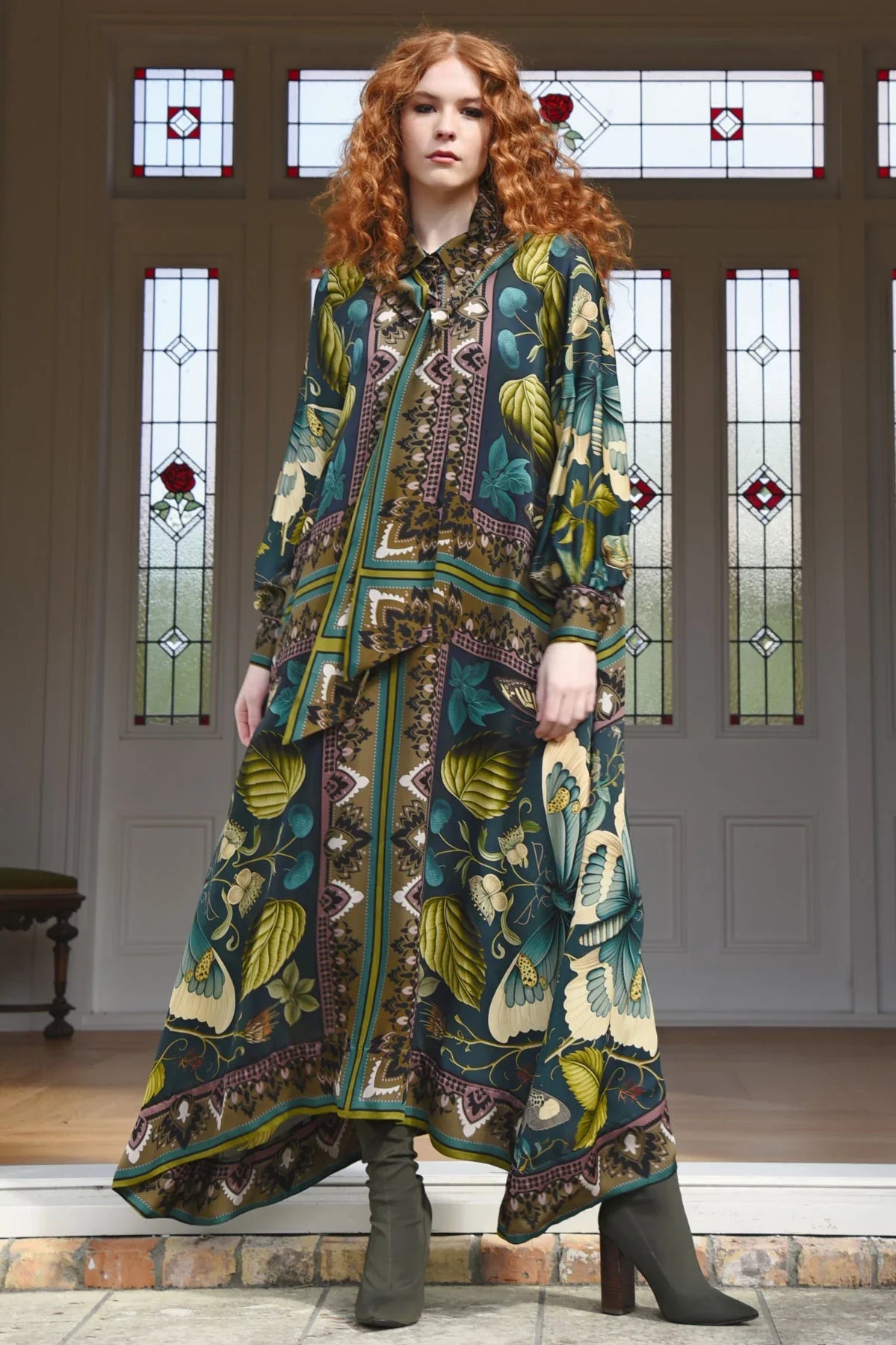
Autumn — Warm undertone, medium to low contrast
Autumn colouring typically includes warm, golden, or olive skin, hair in shades of auburn, chestnut, warm brown, or dark honey, and eyes in amber, hazel, warm green, or dark brown.
Best colours: Rich, warm, and earthy — terracotta, burnt orange, olive green, mustard, chocolate brown, warm rust, and deep teal. Autumn palettes feel grounded and complex.
Colours to approach carefully: Cool, icy, or pastel tones — baby pink, cool lavender, and stark white can make Autumn colouring look flat or ill.
Winter — Cool undertone, high contrast
Winter colouring is characterised by strong contrast — dark hair (black, dark brown, or ash) against fair or deep skin, with eyes that are dark, striking, or icily light.
Best colours: Bold, clear, and high contrast — true navy, black, pure white, icy blue, emerald, deep plum, and bright cherry red. Winter palettes are vivid and defined.
Colours to approach carefully: Warm, muted, or earthy tones — camel, rust, and warm beige can make Winter colouring look muddy or dull rather than striking.
Step Four: Reconsider Your Neutrals
One of the most practical applications of colour analysis is choosing the right neutrals — because black, white, grey, and beige do not flatter everyone equally.
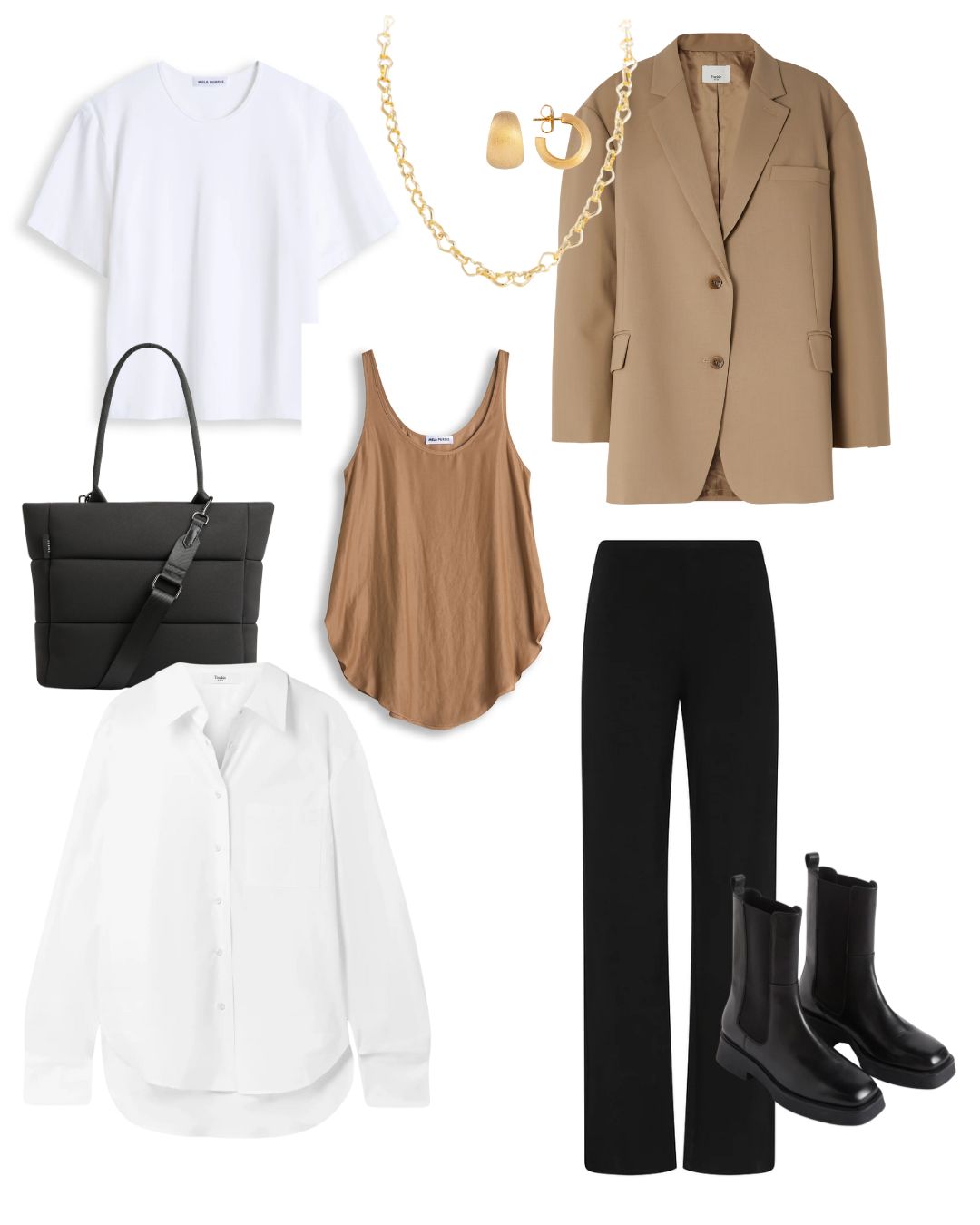
- Warm undertones often look better in cream, ivory, camel, warm taupe, and chocolate than in stark white or cool grey
- Cool undertones often suit charcoal, soft white, cool grey, and navy better than camel or warm beige
- High contrast colouring can carry true black effectively; low to medium contrast individuals may find it ageing or flattening at the neckline
- Soft white or off-white is almost universally more flattering than brilliant white at the face, regardless of undertone
Getting your neutrals right is arguably more impactful than knowing your accent colours, because neutrals form the foundation of most wardrobes.
Step Five: Apply It to Your Existing Wardrobe
You don't need to start from scratch. Your wardrobe already contains clues.
Do a quick audit. Pull out the pieces you reach for most often and the ones you consistently receive compliments in. Look for common threads in those colours — you'll often find a pattern that aligns with your seasonal palette before you've even consciously identified it.
Notice where colour sits in relation to your face. A colour that overwhelms you at the neckline may work perfectly as a trouser or skirt. The closer a colour is to your face, the more it matters that it falls within your palette.
Test colours in natural light. Artificial lighting, particularly in changing rooms, distorts colour significantly. If possible, step outside or into natural light before making a decision.
When shopping, hold the fabric to your face rather than judging it on the hanger. The question isn't whether the colour is beautiful in isolation — it's whether it makes your skin look clearer and your features more defined when placed next to them.
Common Mistakes Worth Knowing
Defaulting to black. Black is widely worn as a wardrobe neutral, but it genuinely doesn't suit everyone at the neckline. For warm or low contrast colouring, it can make you look tired or drawn. A deep navy, chocolate brown, or charcoal often achieves the same visual impact with better results.
Confusing colours you love with colours that work. You can love a colour without it being in your palette. The solution isn't to never wear it — it's to wear it away from your face, or balance it with a palette-appropriate piece closer to your neckline.
Shopping under artificial lighting. Colours look genuinely different under store lighting. What appears to be a soft warm camel on the hanger may read quite differently in daylight.
Assuming your palette is fixed forever. As hair colour changes — naturally or otherwise — and as skin tone shifts with age, your most flattering colours can shift too. It's worth revisiting every few years.
Building a Wardrobe Around Your Palette
Once you've identified a few colours that consistently work for you, use them as the foundation of your wardrobe rather than occasional additions to it.
A palette-led wardrobe creates natural cohesion — pieces coordinate without effort because they share the same tonal family. Shopping becomes more focused because you have a clear filter: does this colour work within my palette? Impulsive purchases decrease, and the pieces you do buy tend to be worn more.
Start with your best neutrals, then build in your most flattering mid-tones and accents. Outerwear and knitwear are often the easiest anchors because they appear in so many outfits and set the tonal tone for everything layered with them.
A Final Note
Colour analysis is a tool, not a rulebook. The goal is to understand what naturally works for you, not to eliminate every colour outside a narrow set of shades. Many women find that knowing their palette actually gives them more freedom: less second-guessing, more confidence, and a wardrobe that consistently feels right.
If you'd like to learn more about colour analysis, an article titled Color Analysis: A Comprehensive Guide on theconceptwardrobe.com goes into serious depth around colour theory and personal colour analysis with a lot of illustrated examples. It's a deep dive but worth spending the time on if you have it! For personalised guidance, our team offers one-on-one styling support and would be happy to help you build around your palette. Explore our latest arrivals or get in touch to find colours that genuinely work for you.